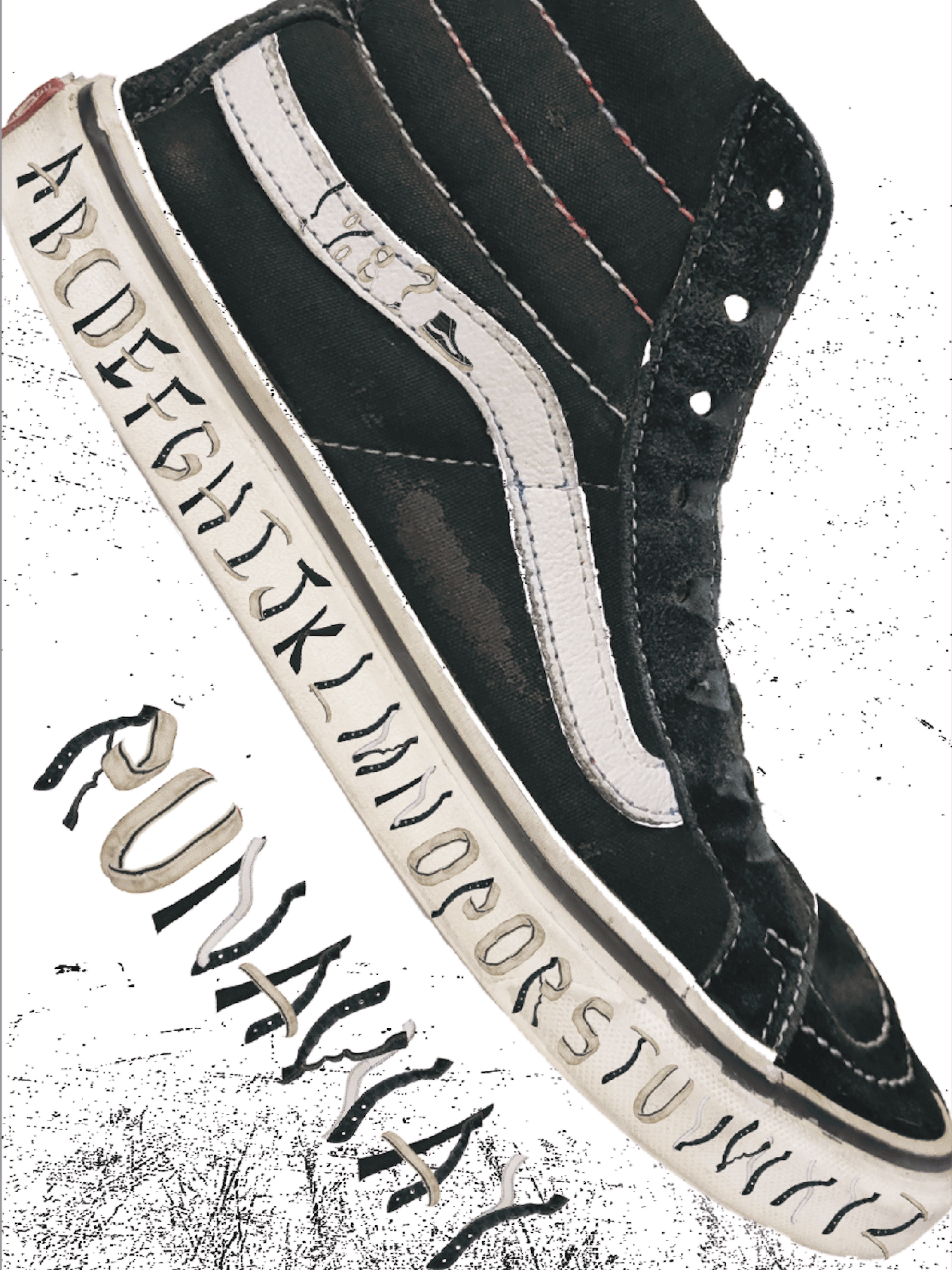
For this project, I created an experimental typeface inspired by a van sneaker, deconstructing the shoe in Photoshop to explore its unique shapes and textures. Each letterform was crafted from pieces of the sneaker, resulting in a dynamic, playful typeface that blends street style with typography. The project pushes the boundaries of design by transforming everyday objects into creative, functional elements.
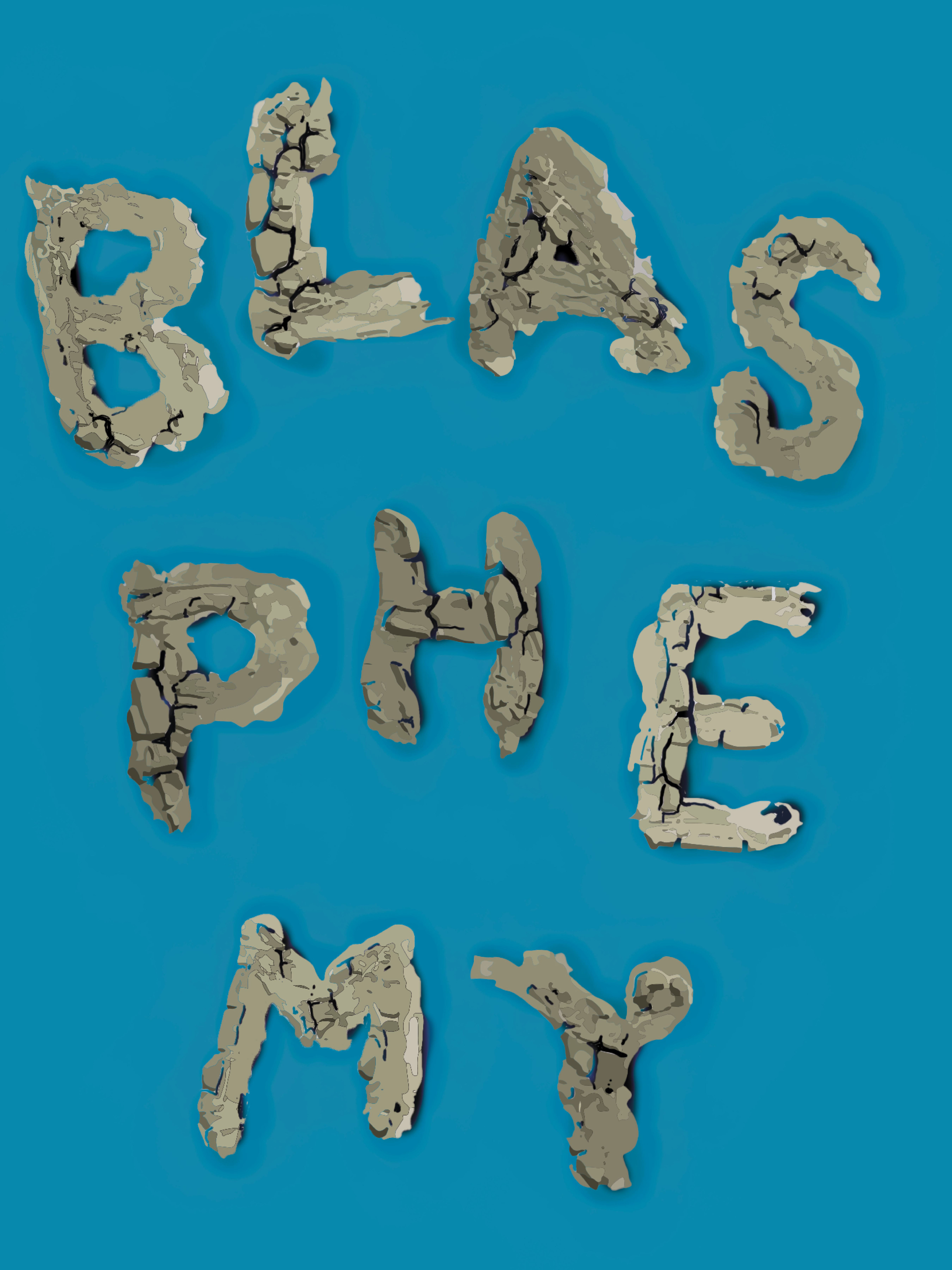
For this experiment, I created a typeface inspired by the transformation of wet clay to dry clay, using digital illustrations instead of real photos. The letters were first designed in their wet, soft form and then gradually "dried" as they transformed into more defined, solid shapes. A GIF was used to visually showcase this change, capturing the fluidity of the process while exploring the contrast between organic and digital design elements.

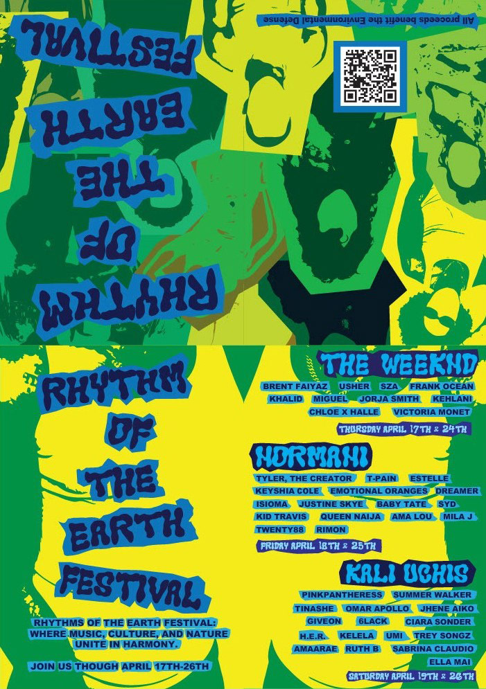
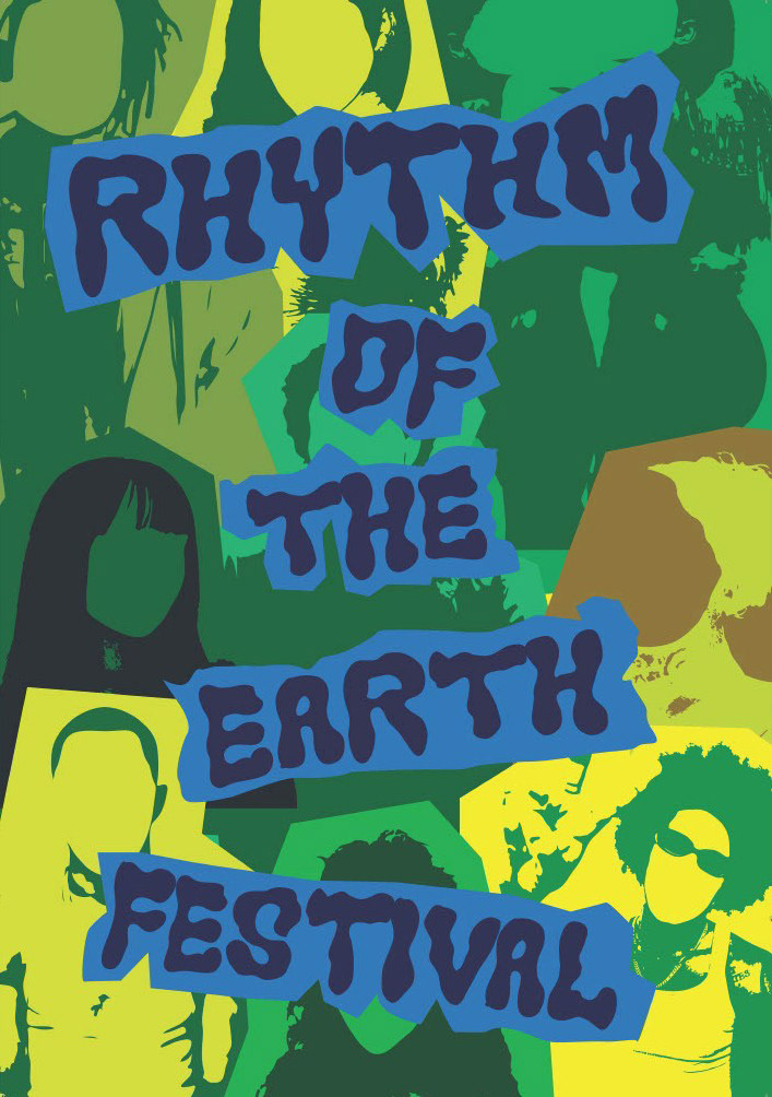
For this project, I created the branding for a fictional R&B festival called *The Rhythm of the Earth*. The festival celebrates the soulful connection between music and nature, blending smooth, rhythmic sounds with an earthy, organic atmosphere. I developed a unique visual identity, incorporating warm, earthy tones and flowing, rhythmic patterns to reflect the harmony between music and the environment. The branding captures the essence of a soulful experience, inviting attendees to connect with both the music and the world around them.